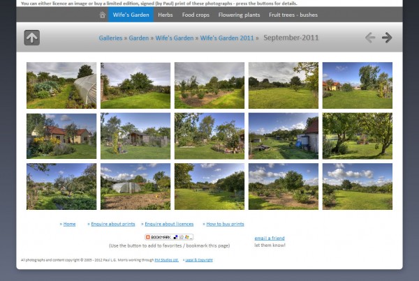
I have reworked some aspects of my website:
 This started when I upgraded my gallery software (Jalbum). There was a new template (skin) that I liked the look of and that was simple to modify. So I started modifying the galleries to this new look – above I show a screenshot of one of the gallery pages. However, I thought that the colour scheme of the main pages of the website was not compatible with that of the galleries.
Looking at the coding behind these galleries, I decided that a complete copy was beyond my skills. So, I took note of some of the main colours used and applied them as a simple change to the website.
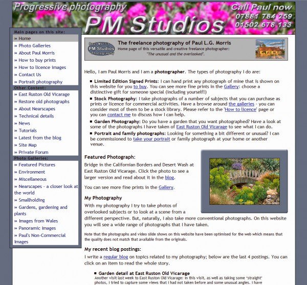
This then meant I had to change some of the graphics elements, such as the banner and logo. The final result is shown below:
 I may go back later and refine some of it, such as the banner image, but I think this is cleaner looking than the old website. You can see it here:
